40. 2 Star Trek Geektastic Layouts
Jul. 24th, 2009 03:08 pmLayout Style: S2 Flexible Squares
Features: Sidebar, Scrolling Tags, Custom Page Summary
Layout Width: 800px
Requested By:

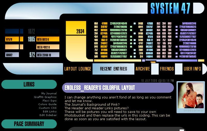
Click to see larger image - Live Preview
Header 800 x 241

Header Link Background


Click to see larger image - Live Preview
Header 800 x 184

Header Link Background

Fonts Used:
Swiss911 XCm BT
Swiss911 UCm BT
See the Font Tutorial if you need help adding these fonts to your computer system.
Check out Using Layouts on the sidebar for any extra assistance.
Please direct people to![[livejournal.com profile]](https://www.dreamwidth.org/img/external/lj-community.gif) layout_lounge or graffitigraphic.
layout_lounge or graffitigraphic.
Features: Sidebar, Scrolling Tags, Custom Page Summary
Layout Width: 800px
Requested By:
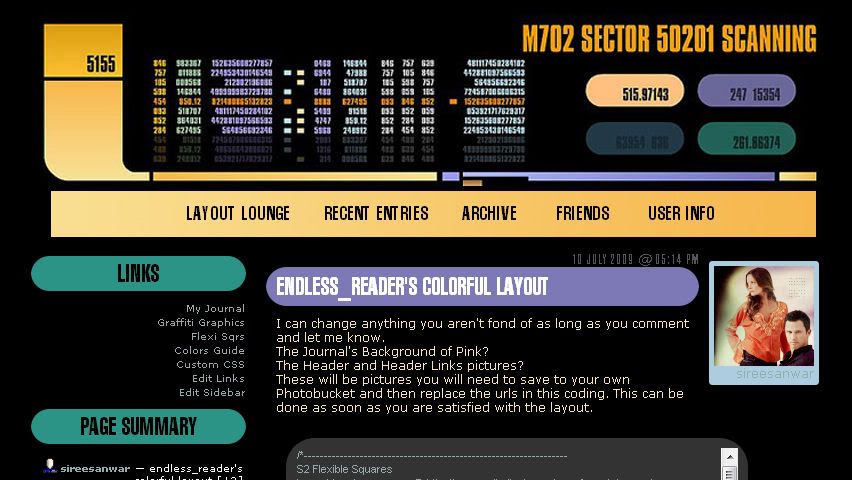
Click to see larger image - Live Preview
Header 800 x 241
Header Link Background
Click to see larger image - Live Preview
Header 800 x 184
Header Link Background
Fonts Used:
Swiss911 XCm BT
Swiss911 UCm BT
See the Font Tutorial if you need help adding these fonts to your computer system.
Check out Using Layouts on the sidebar for any extra assistance.
Please direct people to


 layout_lounge
(no subject)
Date: 2009-07-25 03:54 am (UTC)(no subject)
Date: 2009-07-27 06:02 pm (UTC)(no subject)
Date: 2009-07-30 01:14 am (UTC)(no subject)
Date: 2009-08-23 05:06 am (UTC)(no subject)
Date: 2009-08-24 07:16 pm (UTC)(no subject)
Date: 2009-08-24 08:09 pm (UTC)I want the user pics to still be shown along with the emotion mood things. I also want it to revolve around Jack not Jack AND Sally. I like dark colors and a morbid theme.
If this sounds like something you might be interested in doing, just let me know. I would be thrilled! I will find someone to make me a header if you like as well, just let me know.
Thanks!
(no subject)
Date: 2009-08-24 10:03 pm (UTC)Cool. Just Jack... I'll get looking. It might be a bit but I will get back to you.
(no subject)
Date: 2009-08-24 10:05 pm (UTC)Yeah just let me know if you can't find it and I'll look for something. I really appreciate you willing to look into it for me.
:D:D
*gives a basket full of cookies*
(no subject)
Date: 2009-08-25 03:12 am (UTC)(no subject)
Date: 2009-08-26 12:30 am (UTC)(no subject)
Date: 2009-08-26 12:31 am (UTC)(no subject)
Date: 2009-08-26 12:47 am (UTC)(no subject)
Date: 2009-08-29 12:01 am (UTC)You can see the layout live here
Artwork:
Please be brutally honest because I want you to like it. I can change just about anything.
(no subject)
Date: 2009-08-29 02:26 am (UTC)I also think I prefer the header banner that you have in the preview. I love the little flickering light.
I don't have my journal friends only but I will definitely use the banners you made if I do ever go that way. The icon is perfect as well.
The only thing I wonder if you could change, I got he idea from the friends banner with "scare to be added"...
Where people comment on the entries, could the wording be changed from "leave a comment" to "let out a scream" and "# comments" to "# screams"
The text at the top as well for the example Layout Lounge, Recent Entries etc (I know thats mainly because its your journal) but could I have those changed as well to match the theme? I'm not sure what they should be though.
I also don't know if these things are things I have to change myself because they may be. I know that when I applied the theme I have now I had to go in and change some of those, so it may just be I have to change them once it is applied.
I don't think I need the page summary, if that could be removed. I do want a little blurb or blob on the side so I can welcome people to the journal.
I can't see if the mood theme works since you don't have any on the entries, but I wanted to make sure they were there as well.
I hope I don't sound bad by asking all this!
Thank you so much though, I really do love it.
...Is is possible that I can save all the headers and switch them in and out on the layout?
(no subject)
Date: 2009-08-29 02:33 am (UTC)I mean like instead of the line under links you could have a strip that is like the background. I remember seeing a similar request when I was looking through your layouts and comments but I can't remember which one to show you exactly what I mean.
(no subject)
Date: 2009-08-31 07:31 pm (UTC)Be as specific as you can because it is hard to convey what we are thinking... point out specific places on the layout you would want to see this....
I don't remember anyone asking for something like that in the past.
(no subject)
Date: 2009-08-31 08:06 pm (UTC)AHA! I found the layout that made me think of it. Here (http://i407.photobucket.com/albums/pp157/scholarslayouts/wedding/preview.jpg)
I want something similar but not exactly the same. I don't want it on the comments. I took a screen shot to show you what I mean. You can see it here (http://i725.photobucket.com/albums/ww256/bouncytime20/NBC.jpg).
You were right. It wasn't the line underneath it was the entire word. So hopefully that explains it a bit better. :D
Also, like in the preview, is it possible to put the default icon on the sidebar or is that another one of those customizations I can do?
Thank you for the link for figuring all that stuff out! You've been a real help and you explain things very well.
Once I have the layout up and running I'm going to do a post that shows the friends only banners because even though I won't be using them right away I want others to be able to see them. From that post I will be letting everyone know, as well as my profile, who made them and the layout and leaving links to your graphics comm and here so they might be able to request from you as well. :)
Which reminds me, do you have a specific way you want to be credited in the profile?
(no subject)
Date: 2009-08-31 09:22 pm (UTC)http://community.livejournal.com/workshop_rees/
The default icon is the same as the page summary. It will be something you change and add in the sidebar customizations.
I send people to
(no subject)
Date: 2009-08-31 09:27 pm (UTC)I love it. I don't think there is anything else that needs to be changed about it.
(no subject)
Date: 2009-08-31 10:33 pm (UTC)I'm so glad you like it.
FYI for the moodtheme I suggested... there is a quick upload moodtheme tutorial in this journal.
(no subject)
Date: 2009-08-31 10:42 pm (UTC)Thank you so much again. After I get everything settled I'll be doing the post that points people in the right direction to you. I'll also be directing them to your help/request desk so that you don't have something like this on your layout comments again lol.
Thank you again, I can't wait to see how it looks on my journal. And just to be sure, you want all images saved to my separate photobucket and then placed in the code stuff...right? I'm really crap at html and stuff lol.
*huggles*!
(no subject)
Date: 2009-09-01 12:30 am (UTC)Thanks!
Yes, all images saved to your photobucket. You will see in the coding places that say (BACKGROUND IMAGE) or (SIDEBAR TITLE IMAGE) or (HEADER IMAGE). These are what you want to change but make sure to leave the ( ).
(no subject)
Date: 2009-08-31 07:27 pm (UTC)That is okay. I just wanted you to have the option of a friends only banner. When I make a layout with artwork I try for that. I saw that you liked the icon. I really thought it would look neat. Glad you like it.
Where people comment on the entries, could the wording be changed from "leave a comment" to "let out a scream" and "# comments" to "# screams" See Here (http://community.livejournal.com/layout_lounge/15658.html)
The text at the top as well for the example Layout Lounge, Recent Entries etc (I know thats mainly because its your journal) but could I have those changed as well to match the theme? I'm not sure what they should be though.
The link above will help you change all of these things. The Layout Lounge link is simply my profile link. Yours will be different when you implement this layout.
They are things you will change yourself. As for the page summary. If you don't have it working currently it will not be displayed. I'm simply showing you that if you use the Page Summary it has been customized.
The blurb is also something you will go into the Customization and add on your own.
As for the mood theme. I just didn't use it on this journal much but it will show up. I also found a moodtheme at another community for you...
http://community.livejournal.com/engravedicons/912.html
You don't sound bad. This is exactly why I created this comm.
Also, I plan on posting these images to
In other words... go for it! *lol*
(no subject)
Date: 2009-08-31 08:08 pm (UTC)I also completely understand that you will put your work out there for others besides myself to use. I would expect it. :)
I wouldn't want to deprive others of such an amazing layout and graphics. Especially as hard as it is to find around LJ. :D
(no subject)
Date: 2009-08-31 09:23 pm (UTC)(no subject)
Date: 2009-09-01 12:35 am (UTC)Okay so I see the fancy font on your LJ subjects and Sidebar titles... do you? (You can see an example in the layout post here)
Also I love what you've called your header links and your sidebar titles.
Enjoy!
(no subject)
Date: 2009-09-01 12:50 am (UTC)Really good job with that! :D
(no subject)
Date: 2009-09-01 01:10 am (UTC)(no subject)
Date: 2009-09-01 06:34 pm (UTC)(no subject)
Date: 2009-09-01 06:33 pm (UTC)Thanks. Enjoy.
(no subject)
Date: 2009-08-26 12:24 pm (UTC)(no subject)
Date: 2009-08-26 05:14 pm (UTC)your assistance please.
Date: 2010-03-17 05:24 am (UTC)any assistance you could give would be appreciated.
thank you for your time,
Christy
(no subject)
Date: 2011-09-26 06:33 am (UTC)Help, if anyone is still watching? Otherwise I'll keep looking for something else. Thanks.
(no subject)
Date: 2011-09-26 08:39 pm (UTC)The backgrounds can remain black. Do you need help piecing together the layout? I can help with that if you like. I also have tutorials about how to implement layouts if that is needed.
(no subject)
Date: 2011-09-26 10:02 pm (UTC)Yes, piecing the layout together isn't going as smoothly as I thought. I have experience with HTML, and granted I didn't keep poking at things very long, but some help would be appreciated. Here's the journal, so you can see what's going on: http://mr-laforge.livejournal.com
The top of the graphic gets sliced off, the two sandwich together so tightly that it cuts off part of the bottom, and the sidebar/entry headers are rectangular rather than circular. Which are the main problems I'm seeing.
It might be worth mentioning I run Chrome primarily, Firefox secondary. I'm not sure how the layout looks in both. But -- thank you in advance!
(no subject)
Date: 2011-09-27 05:32 pm (UTC)(no subject)
Date: 2011-09-27 05:46 pm (UTC)I could define the header image size in the code, but I think that might just add a new problem when it comes to rendering the image properties in different browsers. Still, might work? For science, and all.
(no subject)
Date: 2011-09-27 07:02 pm (UTC)(no subject)
Date: 2011-09-27 10:15 pm (UTC)Thank you so much for the help; it looks gorgeous. Great work! ♥
(no subject)
Date: 2011-09-27 11:42 pm (UTC)(no subject)
Date: 2011-09-28 03:34 am (UTC)(no subject)
Date: 2011-09-28 05:53 pm (UTC)And sometime they just fit.
(no subject)
Date: 2013-02-25 07:44 pm (UTC)Thanks for this really awesome layout.
(no subject)
Date: 2013-02-27 10:53 pm (UTC)If you check out
(no subject)
Date: 2013-02-27 11:34 pm (UTC)Thanks.
(no subject)
Date: 2013-02-28 12:13 am (UTC)